by Maggie Finch
5
True colours
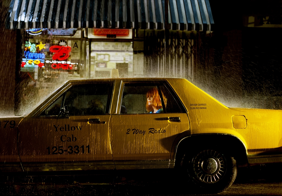
Prager's photographs and films pulsate with juxtapositions of super-saturated colour. Consider, for example, the first sighting of the heroine in Despair – a shot framing the lower half of her legs, the bright red of her high-heels contrasting with the ivory tone of her skin and the green of her dress's hemline. Prager's high-contrast technique, which acts to heighten the emotion of each scene, recalls that of American photographer William Eggleston, and it is no surprise to learn that Prager cites him as an important influence on her work; indeed, she has said that seeing a survey exhibition of Eggleston's works largely inspired her to take up photography in the first place.
Eggleston continues to be recognised as a pioneer of the use of colour in art photography, and as an artist who truly validated colour outside of the area of commercial photography. In the introduction to his iconic monograph William Eggleston's Guide, first published by the Museum of Modern Art, New York, in 1976, curator John Szarkowski wrote of the stimulating effect of Eggleston's use of colour:
121.9 x 177.8 cm
Collection of the artist, New York and Lehmann Maupin Gallery, New York and Hong Kong
Reduced to monochrome, Eggleston's designs would be in fact almost static, almost as blandly resolved as the patterns seen in kaleidoscopes, but they are perceived in color, where the wedge of purple necktie, or the red disk of the stoplight against the sky, has a different compositional torque than its equivalent panchromatic gray, as well as a different meaning. For Eggleston, who was perhaps never fully committed to photography in black and white, the lesson would be more easily and naturally learned, enabling him to make these pictures: real photographs, bits lifted from the visceral world with such tact and cunning that they seem true, seen in color from corner to corner.10
Szarkowski's analysis seems to revel in the ways in which Eggleston's use of colour affects the compositional force and the very meaning of the image. It is interesting to consider his description of the ways in which otherwise deceptively simple and banal scenes were suddenly transformed in Eggleston's hands – scenes taken from the world were suddenly made to 'seem true' when produced in such vivid colour. While Prager seems to adopt a similar 'cunning', her images are constructed entirely. Rather than starting with 'real photographs', her approach sees colour being used for the opposite purpose – to create authenticity, making pre-determined scenes 'seem true'.