Top Arts: VCE 2009
The Ian Potter Centre: NGV Australia, Fed Square
Temporary Exhibition (Gallery 17), Level 3
1 Apr – 20 Jun 10
A major event in the annual school calendar, Top Arts: VCE 2009 again presents outstanding work completed by young student artists as part of their assessment for VCE Art and Studio Arts.
VCE Art requires students to complete a body of works that involves a broad and innovative investigation and the progressive realisation and resolution of ideas, directions and individual concepts, either in an exploratory folio or through one or more visual solutions. VCE Studio Arts requires students to complete a design process that defines an area of exploration in a work brief and the production of a cohesive folio of finished works of art.
This exhibition highlights the National Gallery of Victoria’s strong commitment and support of contemporary art, arts education and showcases the ideas and attitudes of young people. From an initial selection of over 3,000 works and through a rigorous selection process and short listing procedure it is anticipated approximately 60 students are represented in the exhibition with a diversity of media including painting, drawing, sculpture, multimedia and installation.
Jessica Eva
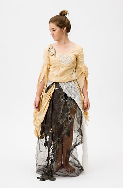
Jessica Eva
Marie Antoinette’s decline from power 2008
silk, calico, lace, tulle, silk organza, silk shibori, newspaper, cotton thread, tea dye, nuno felting, elastic, Velcro
(a) 44.0 cm (centre back), 48.0 cm (sleeve length) (bodice)(b) 113.0 cm (centre back), 36.0 cm (waist, flat) (skirt)
Our Lady of Sion College, Box Hill
Art
Our Lady of Sion College, Box Hill
After viewing Sofia Coppola’s film, Marie Antoinette, I became fascinated by the life of the eighteenth-century royal and investigated her at different stages throughout her life. My interpretation highlights her transition from the affluent, extravagant French queen to her exile where she faced execution by the French public. I represented her reign using lavish fabrics such as red silk and velvet, while this second garment has a distressed appearance and texture to illustrate her downfall. My focus was not on the typical retelling of her experiences, but a more personal and empathetic reflection on her life.
Tara Whalley
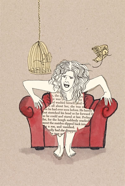
Tara Whalley
from the series Fear of ageing 2008
fibre-tipped pen, collage and watercolour on cardboard
27.0 x 18.0 cm (image) (each)
Plenty Valley Christian College, Doreen
Art
Plenty Valley Christian College, Doreen
My piece follows a young girl’s struggle with ageing within a Western context. The couch represents an aged person in her life, showing the changing nature of the elderly and the inevitability that she too will age. The series incorporates my love of repetition, watercolour, line, paper, birds and red couches, and my concern for how the elderly are viewed and treated. I am paying tribute to the beauty of things from a time gone by to remind my audience that no matter what their physical appearance, every person should be treated like a ‘priceless antique’.
Lucina Lane
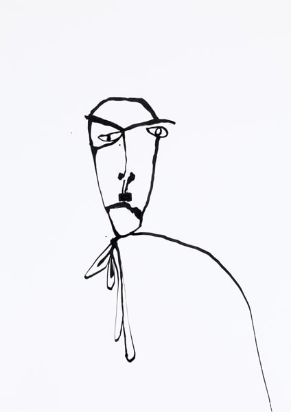
Lucina Lane
comme ci comme ça 2008
(1) 57.7cm x 41.4 cm (2) 57.4 x 41.0 cm
pen and ink
Loreto Mandeville Hall, Toorak
Art
Loreto Mandeville Hall, Toorak
I was interested in the Renaissance idea of the neo-platonic ladder, which allowed people the possibility of moral ascension to the realm of angels or descension to that of animals. I found a contrast between this ideology and our society’s desire to group people in a reductive moral dichotomy of good or evil, disallowing the oscillation between these states. This led to a broader interest in the duality of people, explored in my work in the two figures.
Tim Lyons
Tim Lyons
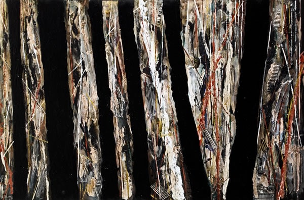
Linear trees #1 2008
synthetic polymer and enamel paint on collage, on canvas with bitumen
101.5 x 152.6 cm
Ballarat Clarendon College, Ballarat
Art
Ballarat Clarendon College, Ballarat
Deeply affected by the Black Saturday bushfires in February 2009 I wanted to depict the ambiguity of the landscape from an unconventional perspective. Initially based on aerial photos, I worked to simplify basic forms. The black lines work as both structural elements and images of the burnt trees, showing the destruction of the environment and creating an otherworldly quality. Contrasting with these black trees are punctuations of colour, mirroring the regeneration process and symbolising the resilience and perseverance of the people in the affected regions, who have, like nature, begun the rebuilding and healing process.
Timothy Jeffs
Timothy Jeffs
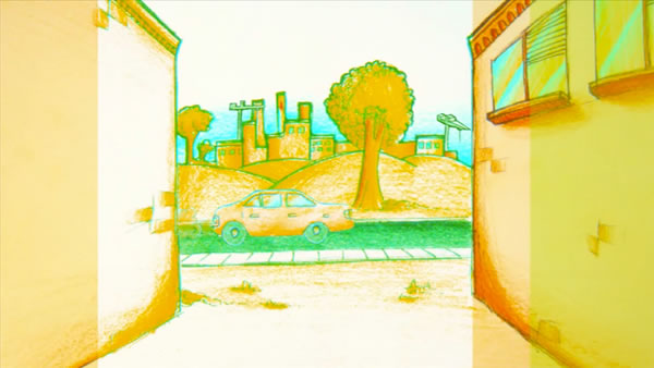
stills from Constructing compression 2008
colour video animation transferred to DVD, sound
2 min
Overnewton Anglican Community College, Keilor
Art
Overnewton Anglican Community College, Keilor
Inspired by the music of industrial and digital artists, my aim was to reveal how the continuous expansion of our urban environment, population and technology could affect our surroundings and express the stresses and confinement felt in this future high-speed life. My animation depicts Melbourne travelling progressively into the future, beginning with an open, calm, relatively natural and recognisable scene that gradually transforms into a congested future society, with digital glitches and artefacts increasing in presence to signify the coming of the digital age. The graphics were hand-drawn and animated in Adobe Flash.
Esther RaWorth
Esther RaWorth
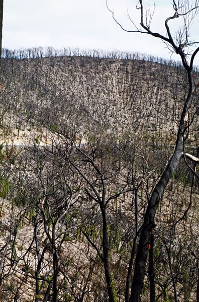
Untitled 1 2008
colour inkjet print
82.5 x 54.4 cm
Wesley College, Melbourne
Art
Wesley College, Melbourne
The idea behind the photograph was to convey not only the devastation of the Black Saturday bushfires but also the beauty that followed – the contrast between death and new growth. I am interested in the work of artists such as Arthur Streeton, Fred Williams, Philip Hunter, Don Kirby and Ansel Adams, and the manner in which each has explored the grandeur of landscape. This depiction of land in extreme conditions, triggered by changes in climate and the impact of human expansion, aims to reveal the surreal beauty which is often a residue of a devastating fire.
Kathleen Kopietz
Kathleen Kopietz
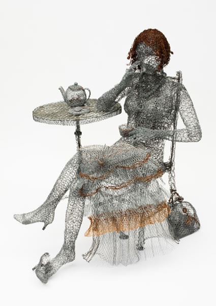
Ruby 2008
wire, copper wire, metal
128.0 x 132.5 x 117.0 cm
Warrandyte High School, Warrandyte
Art
Warrandyte High School, Warrandyte
Inspired by an installation by Ricky Swallow and figures by Peter Corlett, I sought to draw the two sources together in my work. As I worked through the design process a figure in repose sitting amongst everyday paraphernalia crystallised. I captured this concept in recycled old chicken wire I had collected. The dainty, elegant female form evolved out of the typically masculine and rough medium, an unintentional juxtaposition occurring between the material and the subject. The work encourages the viewer to speculate on the context and mood of the piece and create their own interpretation.
Shannon Contin
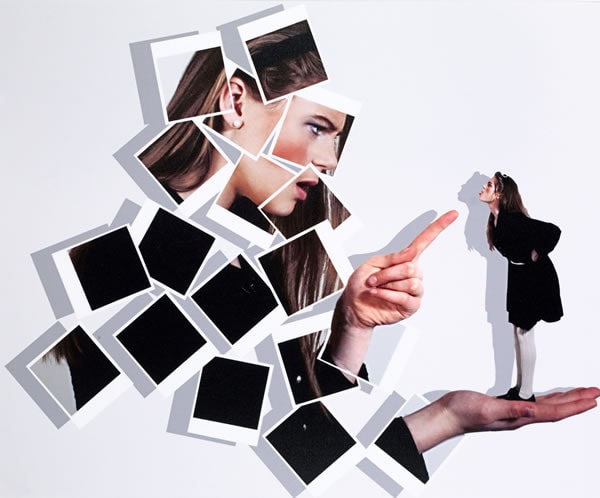
Shannon Contin
Inner self… 2008
colour inkjet print
52.4 x 63.4 cm
Loreto Mandeville Hall, Toorak
Art
Loreto Mandeville Hall, Toorak
This image aims to depict the inner-self by presenting a smaller version, the inner voice which steers the girl in the correct direction, arguing about what is right and wrong with the larger version of herself. Everyone has such a different outlook, relying on their conscience and what they believe to be right in life. The image replicates how one’s conscience dictates what decision should be made, while it is up to each individual to choose. This was inspired by observing people making daily life-changing decisions by asking themselves what they believe to be correct.
Stephannie Roll
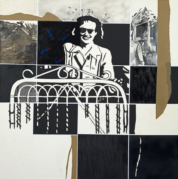
Stephannie Roll
Approaching the gate 2008
synthetic polymer paint on canvas
121.5 x 121.5 cm
Loreto Mandeville Hall, Toorak
Art
Loreto Mandeville Hall, Toorak
An interest in texture led to a collage of ideas with a generational theme. My grandmother is the subject and I incorporated symbols to represent her journey through life. To explore texture I divided the background into a grid and used various techniques within the areas. I used a limited colour palette to highlight the texture, initially applying a layer of subtle colour in some squares. The figure was influenced by using the threshold technique in Adobe Photoshop. Areas of tape were used to create free-flowing lines and break up or pull together the hard-edged lines in the background.
Michelle Molinari
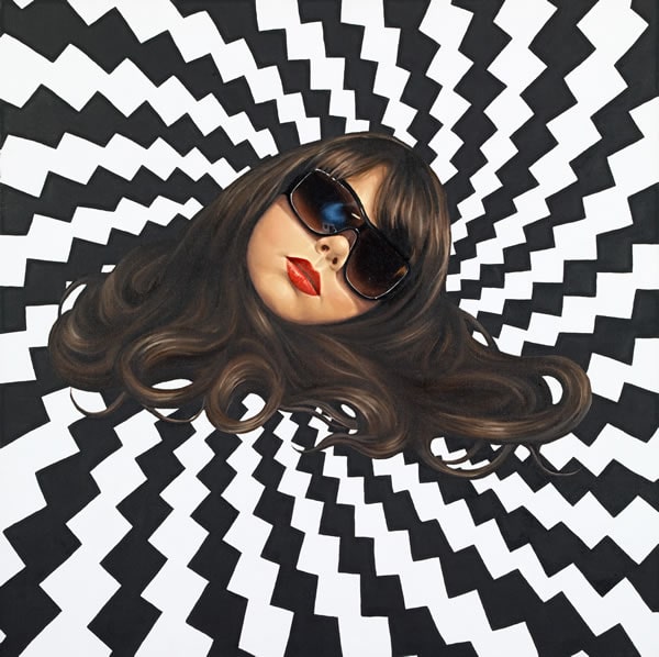
Michelle Molinari
A spiral of emotion 2008
oil and synthetic polymer paint on canvas
76.2 x 76.2 cm
St Peter’s College, Cranbourne
Art
St Peter’s College, Cranbourne
My focus was on Surrealist portraiture juxtaposed against a non-existent surrounding that reflects the emotions of the subject. The intention of this self-portrait was to focus on my emotions and feelings towards art and the notion of losing one’s head over art, which suggests a loss of composure through the numerous frustrations associated with one’s artistic nature. The spiralling optical background reinforces this feeling of being overwhelmed and confused through the hypnotic momentum of the patterning. Painting on linen allowed for subtle blends of tonal variation and a smooth application of paint.
Amy Lawrance
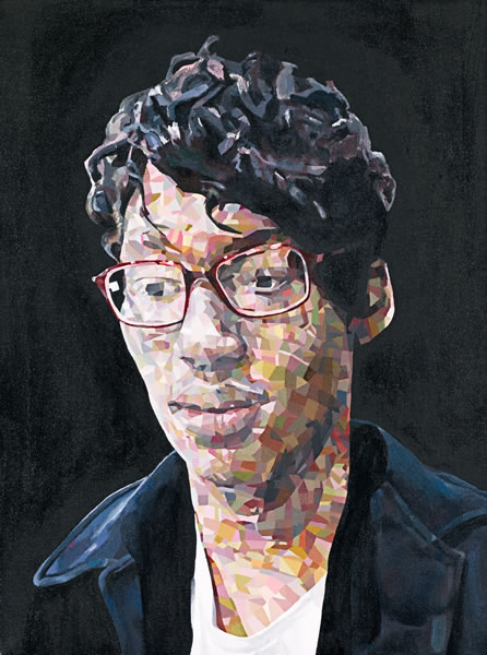
Amy Lawrance
Tobias 2008
synthetic polymer paint on canvas
60.0 x 44.5 cm
Bendigo Senior Secondary College, Bendigo
Art
Bendigo Senior Secondary College, Bendigo
I investigated introspection – the human capacity to look within and ponder the unobservable characteristics that determine who we are intellectually and emotionally. Drawing inspiration from James Gleeson’s surreal ‘psychoscapes’ and Pablo Picasso’s cubism I experimented with distortion, selecting close friends as subjects on which to base my explorations. Originally photographing Tobias’s face under artificial light I captured a chiaroscuro aesthetic giving intensity and depth. I used the minutiae of detail and fragmented shapes to reconstruct Tobias’s face. I wanted to create a fractured appearance and ultimately elucidate his pensive state.
Jack Crosby
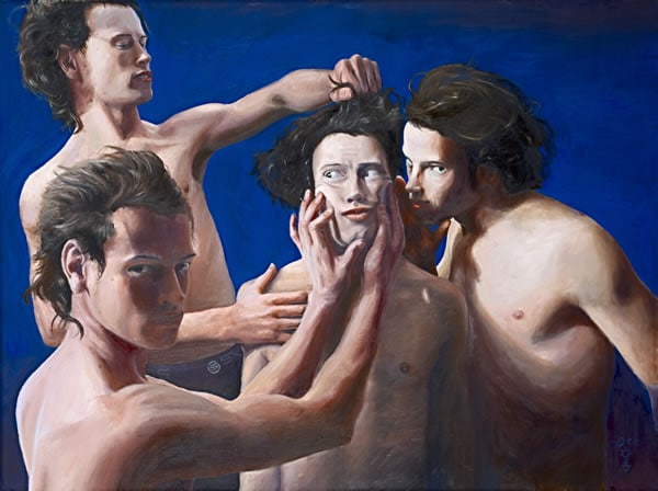
Jack Crosby
Oneself 2008
oil on canvas
91.4 x 122.7 cm
Christian College, Geelong
Art
Christian College, Geelong
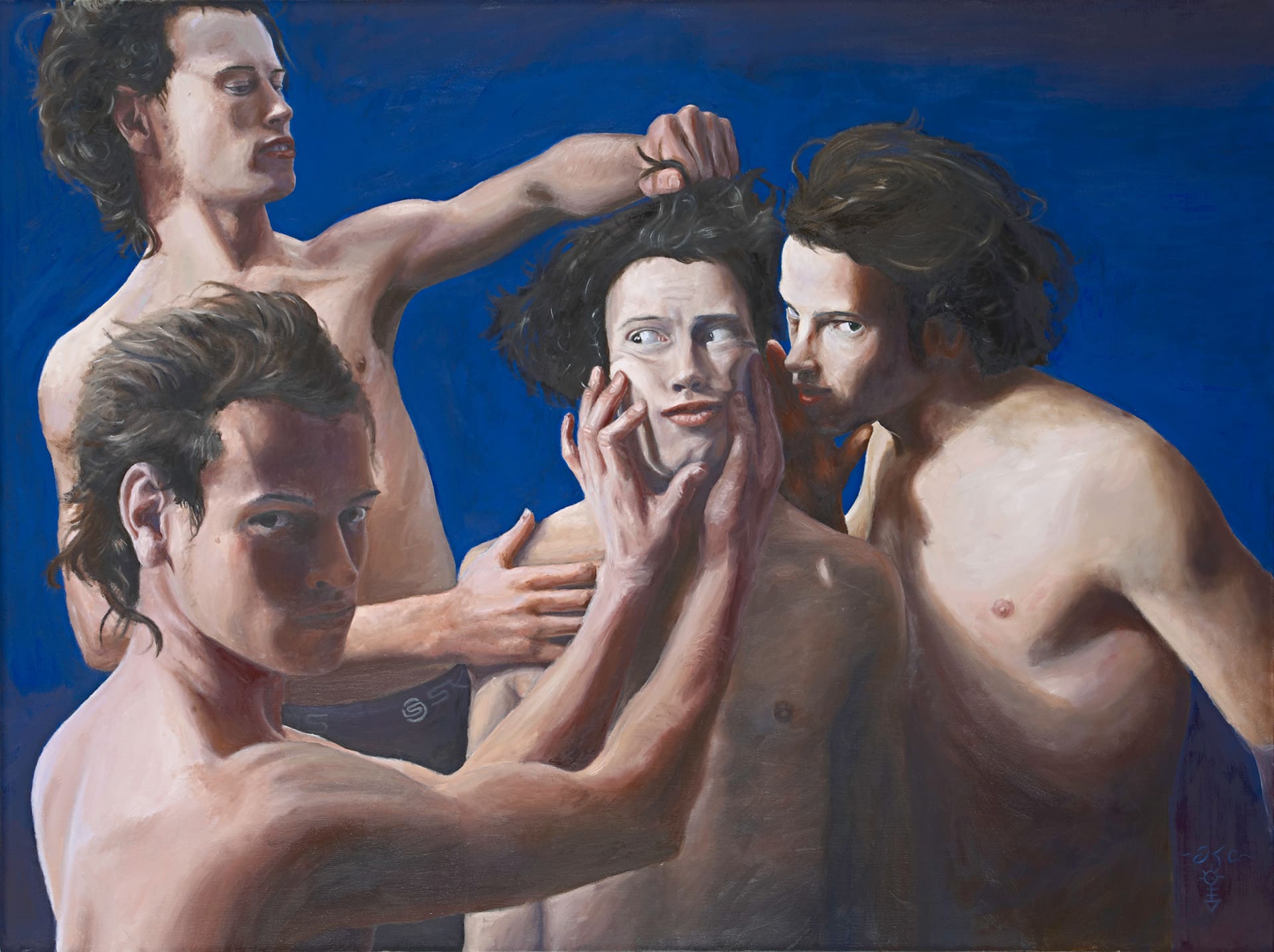
Much of the conflict we experience in life is internally generated in the mind, rather than a response to external influences. As emerging adults we scrutinise every aspect of our minds and bodies, often harshly. I wanted to create a technically accomplished self-portrait that conveyed these tensions. Inspired by the ability of the old masters to create emotion, I wanted to evoke classical form and colour with a postmodern twist; I am a regular Australian schoolboy who plays footy and wears Skins to training, portrayed in a High Renaissance style, tormenting myself like any other human being.
June Chen
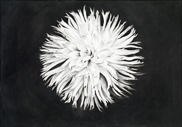
June Chen
Still life flower 2008
57.5 x 82.0 cm (image)
Wantirna College, Wantirna
Art
Wantirna College, Wantirna
While attending an intensive summer course in China I discovered that still life drawing involves a traditional structure and composition. I created a mixture of traditional and contemporary still-life drawings by using charcoal on paper to emphasise the extreme contrasts in my subject matter, thus intensifying the images. It was important that every detail in the drawing had the correct perspective, especially when elements were repetitive. I needed to focus on small details as they have a direct effect on the shape and the lighting of the subject.
Eleanor Milentis
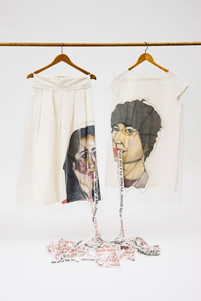
Eleanor Milentis
Conversations 2008
calico, silk, polyester, cotton, silver and glass beads, wood, metal
153.0 x 120.0 x 65.0 cm (variable) (installation)
Eltham College of Education, Research
Art
Eltham College of Education, Research
Conversation plays an important, integral role in our lives and communicates feelings, emotions, thoughts and ideas that we might otherwise find difficult to express. I was inspired by D. H. Lawrence’s novellas to explore dominant elements such as one party controlling another in conversation. I wanted to provide insight into the mechanics of conversation through elements such as exchange, response, emotions, reactions, giving and taking. The garments represent the exterior elements and the personas we project to protect our social boundaries. I used different fabrics to demonstrate the many layers that constrain conversation between people.
Tia Mellios
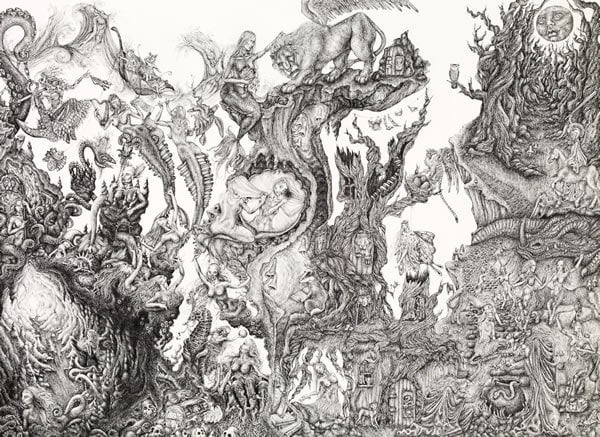
Tia Mellios
Untitled 2008
from A fictional and fairytale forest displayed in a narrative style series
black copic fibre-tipped pens on Fabriano paper
55.0 x 75.0 cm each
St Catherine’s School, Toorak
Art
St Catherine’s School, Toorak
This is a narrative where a visual story is suggested, not actually defined. After being confronted with a chaotic collaboration of line work I want the viewer to hunt and seek in the jungle of subject matter to discover the finer detail not initially noticed. The creatures, characters and worlds are inspired by memories, interpretations and dreams from my childhood and current life. I wanted to create depth and perspective, and achieved this through a series of organic, geometric, fluid, ridged and layered lines using fine-liner pens.
Vicki Karavasil
Vicki Karavasil
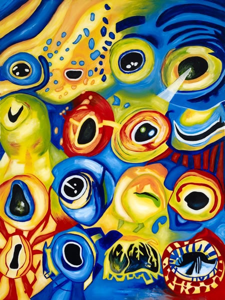
Fish eyes 2008
synthetic polymer paint and synthetic polymer resin on composition board
120.3 x 90.0 cm
Mentone Girls’ Secondary College, Mentone
Art
Mentone Girls’ Secondary College, Mentone
I chose to explore the macro and micro world we live in. I wanted to investigate qualities not often observed by the human eye: sea life, nature, the human body and synthetic materials. I had seen works using resin and experimented to master the medium. I used rich colours to capture the fish eyes, which have a great diversity and can see things that humans usually cannot. I used flowing brushstrokes to encapsulate the beauty of this organic environment. The use of resin intensifies the colours, reinforcing the beauty of the underwater world.
Lachlan Kiernan
Lachlan Kiernan
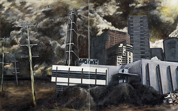
Landscape 2008
oil on canvas
(a–b) 101.5 x 163.4 cm (overall)
St Leonard’s College, Brighton East
Art
St Leonard’s College, Brighton East
Society’s fixation with the perceived ‘battle’ between nature and technology prompted me to explore the relationship both environments share in relation to human existence. I wanted to express nature’s struggle to co-exist with the rapid acceleration and progress of technology. My influences ranged from traditional old master studio artists, such as Francisco Goya and his Dark painting series, to more raw emotive use of elements as seen in the works of Jeffrey Smart and the poignant digital manipulations of Jerico Santander and Chris Haines, which I emulated with oil paint in my apocalyptic landscape composition.
Eleanor Orchard
Eleanor Orchard
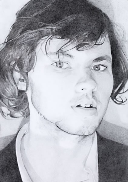
Jackson 2008
pencil
29.7 x 21.0 cm (image and sheet)
Warrnambool College, Warrnambool
Art
Warrnambool College, Warrnambool
The human ability to construct an idealised identity and imaginary life for strangers has always intrigued me. We create false identities to develop the illusion of mutual relationships even though the connection is false, as with infatuation and admiration which can be misguided. Inspired by John Fowles’s The Collector, I sought to create both distance and personality in these grey lead portraits. With no relationship between the subjects and the viewer the subjects’ identity remains unknown. When this work hangs alongside my second work, Maddie, they interact with each other to create the illusion that we are interrupting an unknown conversation.
Jessica Barker
Jessica Barker
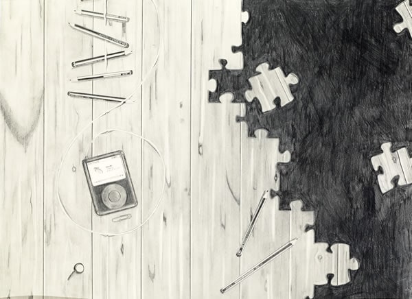
Treble clef 2008
pencil and graphite stick on paper
56.3 x 76.3 cm
The Peninsula School, Mt Eliza
Art
The Peninsula School, Mt Eliza
I find realistic drawings fascinating, especially the mysterious works of M.C. Escher and the photographic replications of William Delafield Cook. Seeking to create similarly intriguing works I drew inspiration from my love of music, both old and new. I combined grey lead pencils and graphite powder, spread with a brush, fingers and tissue, to create drawings that explore the transformation of the music industry, particularly following the advent of technology such as the iPod. I wanted to create a sense of mystery that encouraged the viewer’s own interpretation, as suggested in the jigsaw puzzle pieces
Ryan Mitchell
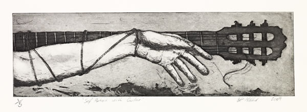
Ryan Mitchell
St Sebastian’s arrow 2008
etching and aquatint, ed.2/5
6.2 x 32.2 cm (plate); 18.6 x 45.5 cm (sheet)
Portland Secondary College, Portland
Art
Portland Secondary College, Portland
The works references the crucifixion and self-sacrifice. It is about being tied down to music and it amounting to nothing. I was frustrated at not being able to play trumpet after I got braces, which delayed me getting into university. The arrow refers to how the martyr Saint Sebastian was killed and links sacrifice and music, symbolising both pain and beauty. Music has its fair share of pain and trauma in a physical and psychological sense. I think the etching successfully portrays both the violence of the arrowhead as well as the soft delicacy of the feathers.
Stephanie Presser
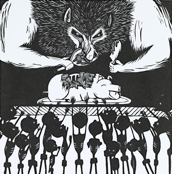
Stephanie Presser
Gluttony 2008
from The seven deadly sins series
linocut
30.6 x 30.0 cm (block); 37.0 x 36.5 cm (sheet)
Fintona Girls’ School, Balwyn
Art
Fintona Girls’ School, Balwyn
Aware of the exaggeration we are exposed to in the mass media, I focused on the borderline between what is fake and what is real. I portrayed the images of the Seven Deadly Sins in today’s society. I used the character of the wolf from childhood fairytales to portray the presence of evil and explore the issues that plague our society, as well as showing how fairytales can be represented in modern-day life without the happy ending. I enjoyed using the medium of linoprinting as I was able to achieve a strong contrast between the black-and-white areas.
Louisa Prozzo
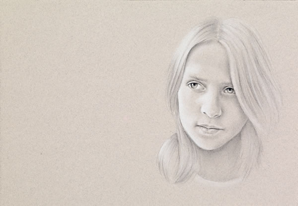
Louisa Prozzo
Isabella 2008
charcoal and chalk on brown paper
28.0 x 40.0 cm (sheet)
Mount Saint Joseph Girls’ College, Altona
Art
Mount Saint Joseph Girls’ College, Altona
I have developed an interest in portraiture, especially the way facial expressions communicate a range of emotions, and the way they are interpreted by the observer. A small curve of the mouth or a movement of an eyebrow can create a whole new expression and meaning. In this image the subject’s stance is relaxed as if she is comfortable with herself, something that is rare, especially among young people. I was inspired by the work of Cherry Hood.
Mark Patten
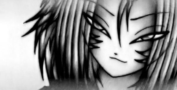
Mark Patten
stills from In the end 2008
black-and-white DVD, sound
5 min, 30 sec
Warrnambool College, Warrnambool
Art
Warrnambool College, Warrnambool
I have been developing animated characters since realising at a young age that I enjoyed drawing. I was inspired to do animation by Hayao Miyazaki, who created Howl’s Moving Castle and pioneered using the anime style in feature films. I have combined my characters with music because I wanted to explore how music can be a primary influence in art. I felt the music gave my animation a greater depth and I decided to use a greyscale colour palette to further enhance the overall mood of the piece.
Alexandra Patrikios
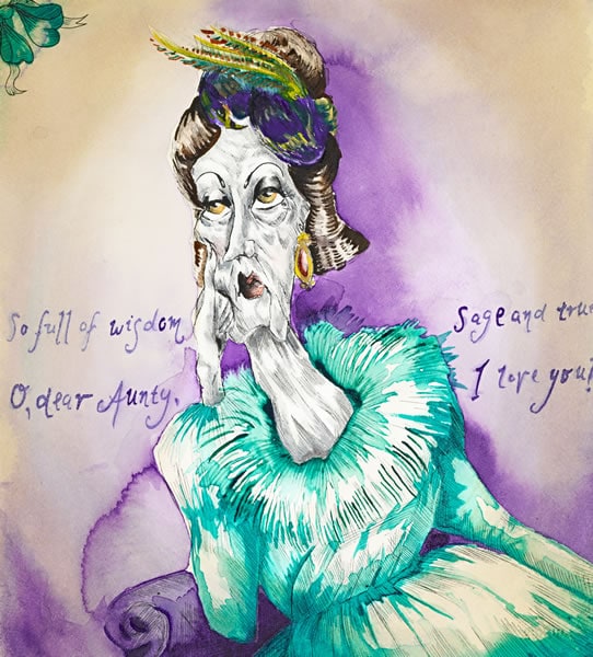
Alexandra Patrikios
The life and times of Tabitha Smoulderberry 2008
pen and ink, watercolour
(1) 33.7 x 30.3 cm (image); (2) 40.4 x 26.3 cm (image)
Ballarat Clarendon College, Ballarat
Art
Ballarat Clarendon College, Ballarat
My work follows the life of an orphan, Tabitha Smoulderberry, after she is plucked from obscurity by a mysterious benefactress, Lady Olivia Hawthorne. As a cunning experiment Lady Hawthorne sculpts her innocent charge into the ultimate social butterfly, but it comes at a cost. When the truth emerges about Tabitha’s humble origins she is promptly shunned by the hedonistic clique of high society and falls into a state of depravity and ultimately, death. Ruined as a result of sacrificing her identity Tabitha’s life is a cautionary tale, championing individual choice above trivial trends and desires.
Oscar Miller
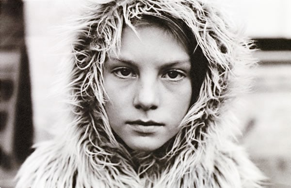
Oscar Miller
Helen 1 2008
inkjet print
22.7 x 14.8 cm (image)
Swinburne Senior Secondary College, Hawthorn
Art
Swinburne Senior Secondary College, Hawthorn
This series was taken of my younger cousin Helen. I was trying to convey a sense of maturity at a young age where certainty is intangible, by utilising a range of costumes and capturing a self-assured look. By taking the images in black and white and processing them myself I wanted to create a timeless feel in the works.
Kate Wallace
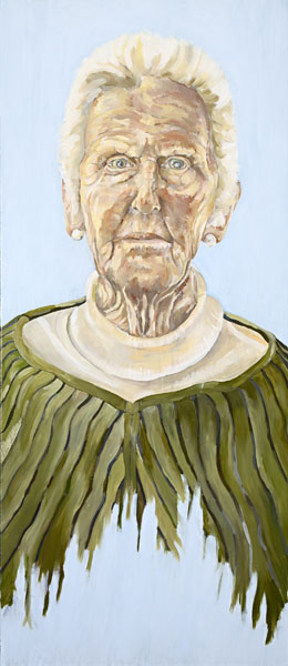
Kate Wallace
Isa 2008
oil on canvas
152.8 x 66.8 cm
Toorak College, Mt Eliza
Art
Toorak College, Mt Eliza
My grandmother, Isabel, is 88 and lives on the coast of New South Wales. My work explores notions of age, fragility and disintegration – how things slowly unravel and decline as people age. However, the idea of ‘ageing’ is not meant to be portrayed negatively, rather my intention is to reveal the beauty in this process. I wanted to show Isabel’s quiet yet intelligent expression. Layers of oil paint convey my grandmother’s character and personality, while the scale and variation of brushstrokes and the harmonising of colour allowed me to express her formidable presence.
Chau Truong
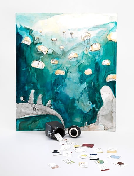
Chau Truong
Floating 2008
pen and ink, watercolour and coloured ink on board
51.0 x 44.0 cm
Strathmore Secondary College, Strathmore
Art
Strathmore Secondary College, Strathmore
His collection of works aimed to illustrate emotions through portraiture and some concepts surrounding human desire. The characters are inspired from daily life but are exaggerated: they represent the idea of individual identity, though power, wealth, intellect and fame. Drawing on a smaller scale allowed me to express my thoughts in a personal way.
Megan Swinstead
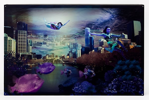
Megan Swinstead
Year 3000 2008
colour inkjet print on transparent synthetic polymer resin, lightbox
55.5 x 85.2 x 9.3 cm
Loreto Mandeville Hall, Toorak
Art
Loreto Mandeville Hall, Toorak
I explored the issues of global warming and the rising sea levels, focusing on both the physical and environmental qualities of water and the ways in which it has continued to affect our society. With the technical inspiration of Melbourne’s contemporary artist Valerie Sparks, I constructed a reality using images I captured from my surrounding resources and environment. Use of Adobe Photoshop allowed me to refine and define images to create the submerged city, as well as manipulate the aesthetic qualities of light, lines, texture, tone and colour to create the whole image under water.
Sarah Matler

Sarah Matler
Destruction 2008
colour inkjet print
38.4 x 302.0 cm
St Leonard’s College, Brighton East
Art
St Leonard’s College, Brighton East
I wanted to express my concerns about the effects of the Black Saturday bushfires on the environment. I chose to portray the devastation and regeneration of the bushland and its ability to survive and regenerate after such destruction. I produced a digital panorama, consisting of twelve sequential images pieced together using Adobe Photoshop, to express the full nature of the tragedy. To emphasise the texture and contrast of the tree trunks the initial images on the left are in black-and-white, gradually transforming across the panorama into the vibrant colours of regeneration.
Brodie King
Brodie King
stills from Start to finish: A history 2008
colour video animation transferred to DVD, sound
2 min, 45 sec
Ballarat Grammar, Wendouree
Art
Ballarat Grammar, Wendouree
‘We learn from history that we do not learn from history’. History tends to repeat itself. It is the story of megalomaniacs carving the world up among themselves and then themselves being carved up. I wanted to explore this human story in a way that was entertaining, memorable and, overall, enlightening. Wrestling with Adobe Flash, I came up with this ‘moving picture’, for that is what history is – the ‘big picture’. And it moves. I hope to have achieved a collision between James Gillray and the book 1066 and All That.
Veronica Parisi
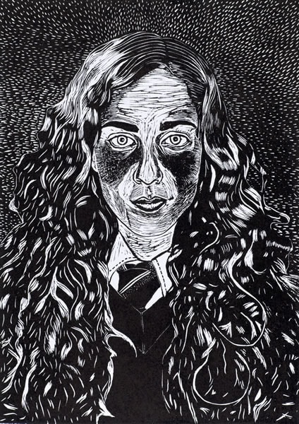
Veronica Parisi
Bianca 2008
from the Portrait series
linocut, ed. 4/12
42.2 x 30.0 cm (block); 50.4 x 39.5 cm (sheet)
Ave Maria College, Aberfeldie
Art
Ave Maria College, Aberfeldie
Captivated by the raw, contrasting aesthetics of black-and-white linoprints, I created portraits of my friends with vacant yet ambiguous facial expressions. In my portrait of Bianca I created form through perceptive and detailed linear carving, I interchanged carving styles to differentiate between areas of the image. I wanted to produce a print that intrigues the viewer in terms of bold contrast, life-sized scale and neutral facial expression, while also being pleasing to the eye through the use of a simple linear background and the sensitive tonal carving used to form the figure’s face.
Heath Kean
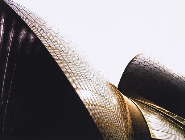
Heath Kean
Metropolis 2008
colour inkjet print
23.7 x 16.1 cm (image)
St Joseph’s College, Geelong
Art
St Joseph’s College, Geelong
As architecture is an avenue I hope to pursue in later life I was interested in the way architects like Mario Bellini manipulate line, shape, colour, pattern, contrast and scale to create the desired dramatic impact. It was important that my photographs exhibit the specific art aesthetic used by architects to create designs that inject intrigue and interest in the production of a structure. I used digital photography, which I manipulated in Adobe Photoshop to adjust light and tone, to emphasise the architect’s aesthetic and encourage an emotional response from the viewer.
Elena Wilkinson
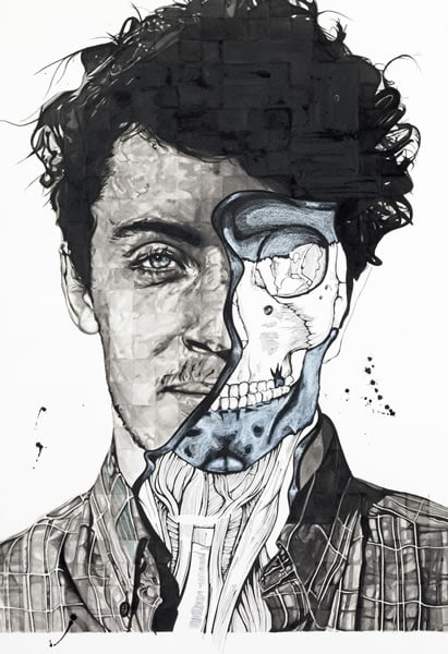
Elena Wilkinson
Banks 2008
pen and ink, brush and ink, pencil on watercolour paper
73.0 x 51.0 cm (sheet)
Geelong Grammar School, Corio
Art
Geelong Grammar School, Corio
I am drawn to dark fantasy novels and artwork, and influenced by Gothic films, such as those by Tim Burton. Within this overarching theme I incorporated my interest in the human body and its internal structures. The intention was to express the beauty and complexity of the body with a disturbing twist. I used a grid to accurately depict the inner body, using photos of family and friends, images from anatomy books and yoga manuals. The fluidity of the ink allowed me to work tonally, increasing the three-dimensionality of the image and enhancing the dark and disturbing realism.
Jeremy Tait
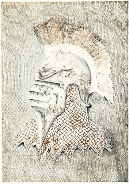
Jeremy Tait
Helmet 1 2008
collograph block print, gouache and graphite stick
59.0 x 42.0 cm (block); 62.0 x 43.0 cm (sheet)
St Kevin’s College, Toorak
Art
St Kevin’s College, Toorak
Simple shaped objects have always appealed to me since I was a child on my grandfather’s farm, probably because of their metallic appearance and simple form. I have a real recollection of this. The metal battle helmet is a strong iconic form. Reflecting the style of Raymond Arnold, I printed fabrics as collograph blocks to produce soft backgrounds and built up the form of the helmet as a collograph print of many layers. I sometimes worked into the prints to add additional mark-making. This idea came from observing the work of Jim Dine.
Evren Velisha

Evren Velisha
Australian War Memorial 2008
colour inkjet print
8.9 x 40.4 cm (image)
Westbourne Grammar School, Werribee
Art
Westbourne Grammar School, Werribee
This is a digital photograph focusing on the highly repetitious and structural elements of the grey pillars that run along the Australian War Memorial building in Canberra. The contrast of the grey and black sandstone blocks simultaneously gives the image both a two- and three-dimensional appeal. This is enhanced by the geometrical lines of the image, producing a photo of minute detail and beauty.
Nabilah Nordin
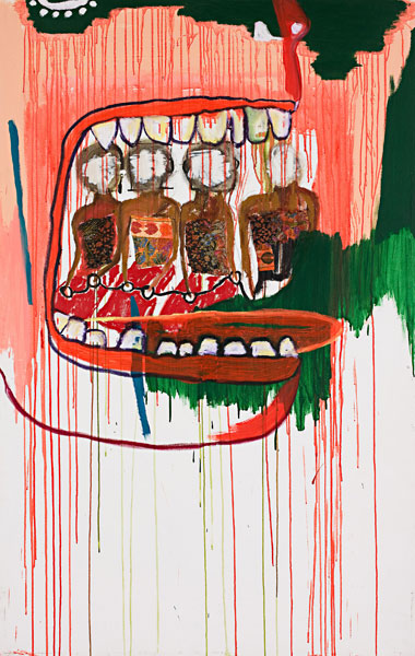
Nabilah Nordin
Outsider (detail) 2008
synthetic polymer paint, metallic paint, oil sticks, watercolour on collage and batik on canvas
199.5 x 210.0 cm (variable)
Wesley College, Melbourne
Art
Wesley College, Melbourne
Change is something that is unavoidable and inevitable. The aim for this piece was to expose the rapid change that continues to occur in Asian culture. Drawing from my mixed Asian background I chose traditional Indonesian batik material in a format of a storybook to create a sense of movement, highlighting the chaotic journey of cultural deterioration. The painterly images serve to question the impact Western society has on other cultures. The emphasis on the mouths symbolises the role of consumerism in cultural change. This piece juxtaposes cultural deterioration against a world of expectation.
Nicholas Park
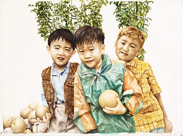
Nicholas Park
Genuine friends 2008
watercolour on paper
41.5 x 59.0 cm
Melbourne High School, South Yarra
Art
Melbourne High School, South Yarra
I am interested in human emotion, especially affection and our longing for it. Based on childhood photographs, I portrayed the warm, innocent friendship of three boys. The challenge was in exploring human faces and various poses. Inspired by Rembrandt and Vermeer, I wanted the work to have a strong emphasis on realism and light. Dynamic composition and facial expressions express the exuberance and enthusiasm of the group. I hope the image will evoke emotion and encourage viewers to remember and contemplate their childhood. By glazing the watercolour I was able to give the work a light, transparent feel.
Daniel Clark
Daniel Clark
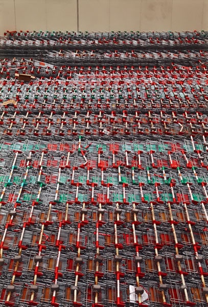
Warehouse I & II 2008
colour inkjet print
90.0 x 61.0 cm
Upwey High School, Upwey
Art
Upwey High School, Upwey
I have materialised a number of ideas, including visually ‘strengthening’ an image through the use of strong shapes and uniform structures, putting the aesthetic quality of an image before any underlying meaning. This makes it harder to build any kind of relationship with an audience, but I have still tried to do this by using fine and intriguing details to draw the viewer in for a closer, more in-depth look. My main source of inspiration is the work of Andreas Gursky, whose large-scale photographs often use the layout of a grid to define uniformity and repetition.
Siena Stone
Siena Stone
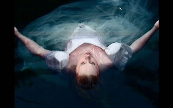
stills from As one I am transported 2008
colour film transferred to DVD, sound
4 min
St Michael’s Grammar School, St Kilda
Art
St Michael’s Grammar School, St Kilda
This visual poem was edited in Final Cut Pro and is accompanied by Spiegel I’m Spiegel by Arvo Pärt and quotes from Hamlet (Ophelia’s drowning). Originally projected onto a three-layered screen to create depth and repetition of the imagery, I wanted to challenge the viewer to look deeper beyond the surface, as one might when looking into a watery pool. The work echoed my exploration into the layers of a young girl’s psyche on the precipice of adulthood. The video unfolds in a hypnotic way to communicate themes beyond the visual and audio, and into the heart and mind.
Harry Hay
Harry Hay
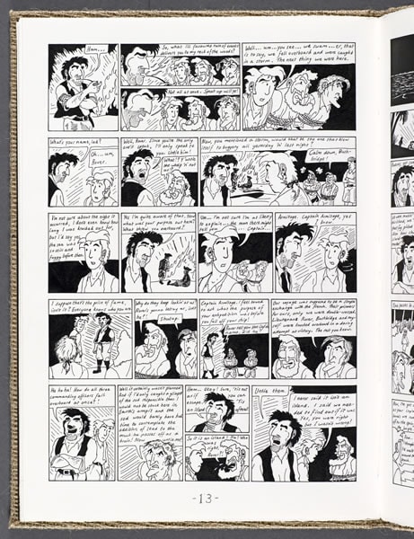
Artist book: Rover and the captains (detail) 2008
fibre-tipped pen, 41 pages, cardboard and hessian cover, glued and stitched binding
39.5 x 28.2 x 1.2 cm (closed)
Princes Hill Secondary College, Princes Hill
Art
Princes Hill Secondary College, Princes Hill
Inspired by rambles around coastal Victoria I wanted to convey my view of the sea, with its harsh unpredictability, as that which divides the strong from the weak. An interest in literature led me to search for identity through my art, and a compulsion to draw led me to discover that comic book form is the perfect medium in which to express my ideas. Having always admired the work of Hergé, I developed my own means of combining visual drama with storytelling. Through these works I have also been able to explore my need for adventure and mistrust of contentment.
Daniel Belfield
Daniel Belfield
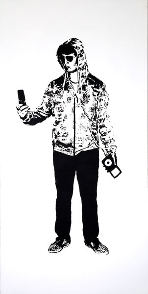
from the series The modern thesis of … Something 2008
synthetic polymer paint on composition board
242.0 x 121.4 cm (each)
Drouin Secondary College, Drouin
Art
Drouin Secondary College, Drouin
‘Possession is nine-tenths of the law’. These works are from nine panels that explore how the popularity of adolescents revolves around materialistic ideologies and the possession of the latest ‘must have’ objects. I have stripped down teenagers to the basics of our primal existence, adding culturally iconic items made notable through our current social evolution. This emphasises the growing self-centred nature of our society, with its multitude of convenient accessories that impersonalise our youth and intrude on our character-defining years. Using stencils allowed me to create a sense of uniformity among the figures.
Tait Sengstock
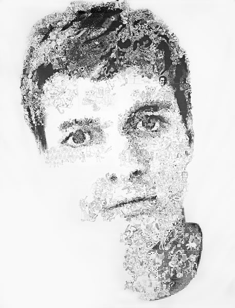
Tait Sengstock
William 2008
ink on vinyl
329.0 x 252.0 cm (unstretched)
Caulfield Grammar School, Caulfield
Art
Caulfield Grammar School, Caulfield
This digital composition of seventy-eight scanned A3 pages of interconnected fine-liner illustrations printed on USB vinyl explores ideas of perception and judgement. From afar the image appears to be a face, but the closer you get the more you can see that the face is made up of lots of smaller images. Conceptually the illustrations use opposing imagery to explore the ways in which the artist perceives the world around him. The work took approximately 1000 hours of hand-drawing for one to five hours daily.
Georgia Walters
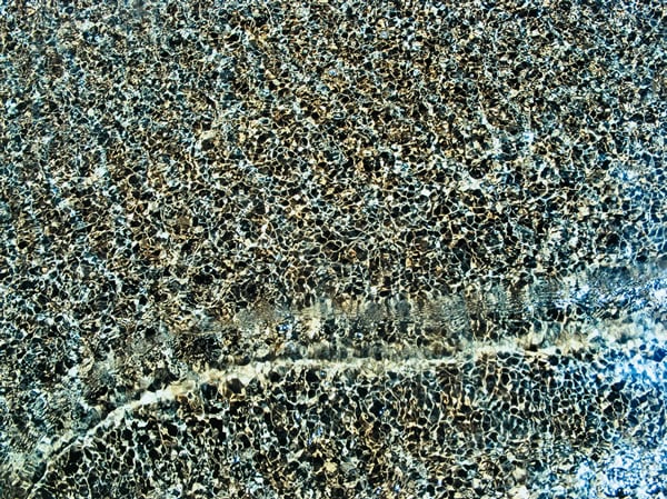
Georgia Walters
Electricity 2008
colour inkjet print
55.4 x 74.0 cm (image)
Ivanhoe Girls’ Grammar School, Ivanhoe
Art
Ivanhoe Girls’ Grammar School, Ivanhoe
I have always loved water. Since I was a child splashing around in the bath I have been fascinated by the way it moves, its patterns and textures and the way it interacts with other surfaces. I began my artistic exploration with an open mind, but was drawn back again and again to exploring water in different settings. The ocean became my focus. I was captivated by its shifting textures and patterns, as well as its wild energy and the dramatic force of water moving in such a large, powerful body.
André Bricknell
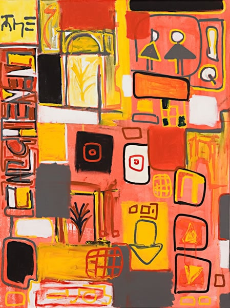
André Bricknell
Enlightenment 2008
synthetic polymer on canvas
122.0 x 91.5 cm
Daylesford Secondary College, Daylesford
Art
Daylesford Secondary College, Daylesford
Abstract artists such as Vasili Kandinsky, Joan Miró, Jackson Pollock and Jean Michel Basquiat all had unique ways of expressing themselves on their canvasses. Their different techniques influenced the development of my personal style and enabled me to convey the abstract images from my imagination onto my artworks. I focused on colour, line and shape, using acrylic paint to tie these elements together and create balanced works. Using paint allows me to reflect the ideas quickly and create works through abstract symbols and images.
Stephanie Dowling
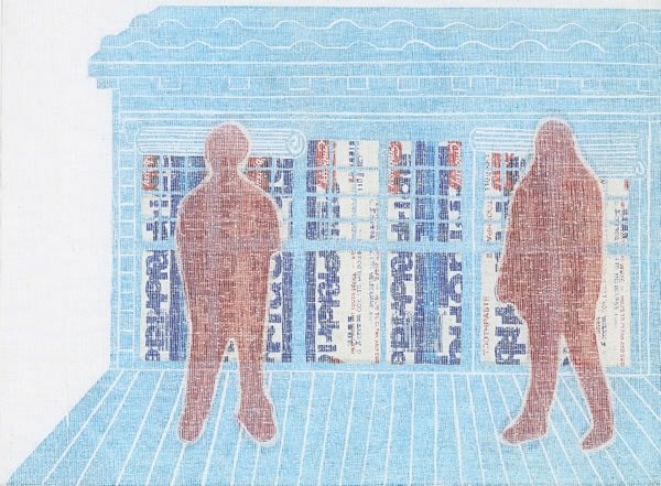
Stephanie Dowling
The family series A 2008
inks on gauze on collage, on polystyrene board
31.7 x 41.5 cm (comp.)
Presbyterian Ladies’ College, Burwood
Art
Presbyterian Ladies’ College, Burwood
My work explores what makes my family important to me, both the physical environment and the relationships. I wanted to show what we do in our house and achieved this by printing on different materials to create a layered effect. Because of this effect, different aspects of the work can be viewed simultaneously. My techniques were inspired by various artists, for example, Kara Walker, who also uses silhouettes, and the collages of Hannah Hoch. I used fabrics, plastic and paper because they reflect the materials found and used in homes, in curtains, containers and floors.
Billie Julien
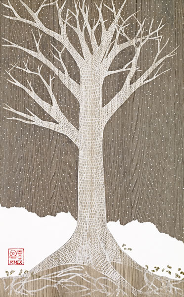
Billie Julien
Autumn 2008
from The Seasons series
synthetic polymer paint, linoprint, watercolour
81.0 x 50.2 cm
Presentation College, Windsor
Art
Presentation College, Windsor
After spending some time in beautiful Japanese gardens, and inspired by my interest in classical fairy tales and manga comics, I wanted to create a piece that expressed the majestic quality of trees. Albrecht Dürer, Nicholas Jones and Arthur Rackham also provided inspiration. I enjoy carving and used linoprinting to create pattern and texture by showing individual cells on a magnified level. By working with different materials and mediums, including linoprinting, wood veneer and watercolour, I was able to express the different ambience and essence of the seasons, and enliven the characteristics of the trees.
Rachel Yong
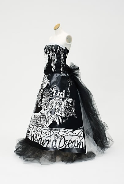
Rachel Yong
A dream within a dream 2008
plastic, tulle, wire
150.0 cm (centre back); 35.0 cm (waist, flat)
Korowa Anglican Girls’ School, Glen Iris
Art
Korowa Anglican Girls’ School, Glen Iris
I wanted to create a culmination of feminine fantasy and dreams. Utilising ‘plastic-cutting’, I created a dreamscape to express the fleeting, romantic, nostalgic sentiments of an intangible past and future, an escape from the sometimes prosaic nature of life. The technique is influenced by Rob Ryan and Sally Smart and the aesthetic is intentionally simple with the use of black-and-white to create strong contrasts and silhouettes. The tulle adds interest and balances the rigidity of the plastic. The dress encapsulates ‘a dream within a dream’ – dreamscape imagery and fantasy themes within a dress of every girl’s fantasy.
Alexandra Higgins
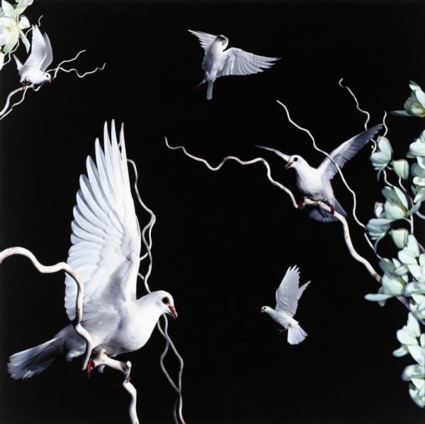
Alexandra Higgins
Love, charity and freedom 2008
colour inkjet print
80.0 x 80.0 cm
Loreto Mandeville Hall, Toorak
Art
Loreto Mandeville Hall, Toorak
I created an image that reflected the symbolism connected with doves, expressing elements of peace, purity, love, hope and freedom. I designed a collage using birds by choosing a number of different photographs and placing them together, while deepening the space within the foreground, middle and background. I was inspired by Samantha Everton and Bill Henson and the ways they use darkness in their works to incorporate childhood and adolescent emotions. The success of the work relied on my ability to capture the doves in a small dark space while flying, sitting or fluttering their wings.
Melanie Ranken
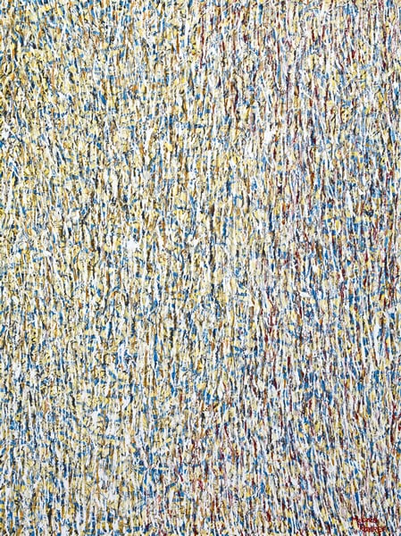
Melanie Ranken
Untitled one 2008
synthetic polymer paint, metallic paint and glass on canvas
122.0 x 91.5 cm
Ballarat Grammar School, Wendouree
Art
Ballarat Grammar School, Wendouree
I believe music is the key to our emotions and I have used this concept as a central theme in my art. My work evolved slowly with an emphasis on colour and texture, as I endeavoured to transfer a sense of undulation, oscillation and movement onto the canvas. I found that certain songs made me connect the mood of the music with different colours, and together they created a vibrant work of art. Textures, including glass beads and thick layers of acrylic paint, were applied to achieve this aesthetic quality.
Olivia Beale
Olivia Beale
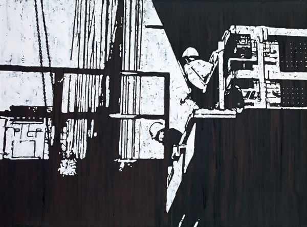
On site 2008
synthetic polymer paint on plaster board
90.0 x 121.6 cm
Mount Saint Joseph Girls’ College, Altona
Art
Mount Saint Joseph Girls’ College, Altona
My focus was to symbolically represent the ‘working-class man’, the blue-collar worker who toils to keep the wheels of industry turning. The crane motif symbolises the heavy workload they must endure to reach their goal. Inspired by the work of Banksy and Paul Davies, I used my own photos to develop the stencils and capture my vision. Thick impasto acrylic paint dripped onto the rough, solid surface reflected the textures of a building site, as did the play of positive and negative space.
Anne-Maree Shelton
Anne-Maree Shelton
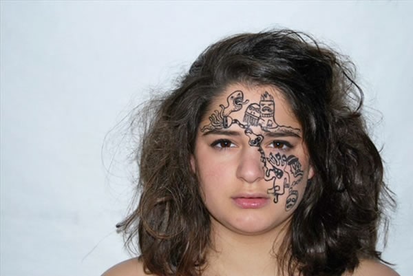
stills from Hello monsters 2008
colour video transferred to DVD, sound
3 min
Sienna College, Camberwell
Art
Sienna College, Camberwell
I looked at human anatomy and disfigured bodies. This led to exploring monsters, a theme used a lot in modern graphic and street art. I became interested in the way people view others as monsters, and the way journalists use the word ‘monster’ to describe certain people. What classifies them as such? The film expresses the transformation and rollercoaster ride of emotions in humans in a conceptual way by using monsters symbolically. By gradually painting onto the subject’s face she is slowly consumed and turns into a raging ‘monster’ herself.
Madeline Dusek
Madeline Dusek
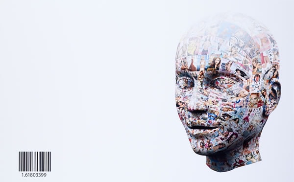
Mathematics of beauty 2008
colour inkjet print on composition board
90.8 x 145.7 cm
Woodleigh School, Baxter
Art
Woodleigh School, Baxter
Having experienced body image pressures while growing up, I explored the struggle faced by young women when grappling with the question of ‘What is true beauty?’ I visually re-created the bombarding, overwhelming impact of the media by repeating Vogue magazine covers that depict the media-created, unrealistic standards of beauty and its negative outcome for women. The glossy, vacant gaze of the mannequin across empty white space reflects that such ‘beauty’ is empty – merely created to drive unconscious materialism. The barcode represents consumerism; the numbers represent the golden ratio – the mathematical equation of beauty.
Jordan Wren
Jordan Wren
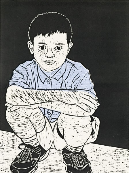
from the Faces of Asia series 2008
linocut on silk
56.0 x 180.0 x 1.0 cm (variable)
Loreto College, Ballarat
Art
Loreto College, Ballarat
My aim was to capture the rich culture and beauty of Asia to express and share my love of the people and culture through my personal experiences of family holidays to the region. I chose to linoprint images of different people from Asia, enhancing and linking the set of prints by printing on envelope paper to capture the importance that colour and pattern has for them. I also created Tibetan peace flags, which express the Asian ideal of peace, by handprinting shellac Balinese-style prints onto silk fabric.
Nina Waldron
Nina Waldron
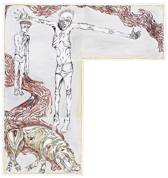
Lord of the flies 2008
ballpoint pen, coloured pastels, washes on four sheets
210.0 x 200.00 cm (irreg)
Christian College Institute of Senior Education, Waurn Ponds
Art
Christian College Institute of Senior Education, Waurn Ponds
I explored the concept of individualism, focusing on its relationship to literature, and each reader’s interpretation of the plot, characters and nature of various novels. I depicted known characters from famous novels based on my own visual perception of their physical appearances and personalities, to create a bridge between the writer, reader and viewer, and to explore the similarities and differences between each of our imaginations. I wanted to capture the expression and individual personalities of the characters through the rough, tense line-work and evoke a sense of knowing and familiarity between both art and viewer.
Molly Baulch
Molly Baulch
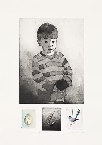
Oscar with nest 2008
etching, aquatint, watercolour, steel, ed. 2/6
40.5 x 23.5 cm (image); 53.5 x 38.0 cm (sheet)
Portland Secondary College, Portland
Art
Portland Secondary College, Portland
Inspired by observing the development of a child into adulthood, especially when influenced by high school and our often sexualised society, I represented these stages using symbolism and the dark tonal qualities of etching. The permanency of marks made in etching act as a metaphor for the lasting effects of decisions made in a young person’s life. The portrait includes a nest, suggesting family protection and support, and in my second work a swooping bird, symbolising the repercussions of behaviour. More literal symbols in the accompanying watercolours and found objects create a sense of innocence lost and the erosion of childhood values.
Salika Souphanh
Salika Souphanh
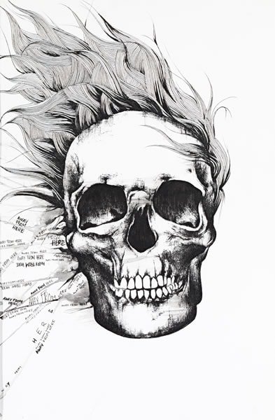
Teenage escape 2008
from The skull series
fibre-tipped pen and ink on paper
60.0 x 40.0 cm
Caroline Chisholm Catholic College, Braybrook
Art
Caroline Chisholm Catholic College, Braybrook
I focused on the vulnerability of being at a twilight age where you are neither a child nor an adult. I am journeying through this changeover myself and feel that many young people, like me, struggle with everyday emotions. I’m influenced by a book called The Perks of Being a Wallflower by Steven Chbosky. I portrayed teenagers in a distorted and twisted manner by creating artworks based on their inner feelings rather than on what can be seen on the outside, which may be contradictory. My artworks explores teenage ‘escapes’ through their behaviour and fashions.
Billy Exton
Billy Exton
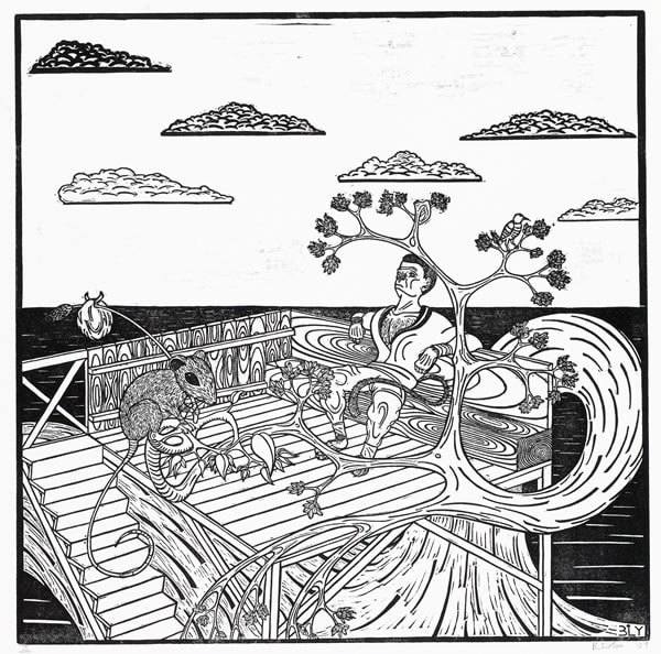
Of mice and monkeys, page 40 2008
linocut, ed.2/6
29.6 x 29.7 cm (block); 57.0 x 37.8 cm (sheet)
St Kevin’s College, Toorak
Art
St Kevin’s College, Toorak
At the beginning of this year, inspired by book illustrators Shaun Tan, Graeme Base and Victor G. Ambrus, and keen to produce works with strong underlying themes linking them all, I drafted a storyboard for a picture book. Experimentation with various artistic devices led me to undertake the painstaking but bold, powerful and potentially quite sensitive medium of linocutting. By the end of the year I was ready to produce and print colourless outlines for several of the book’s pages, including this one. My subject matter was based simply on personal preference.
